Navigating the Analytics Dashboards
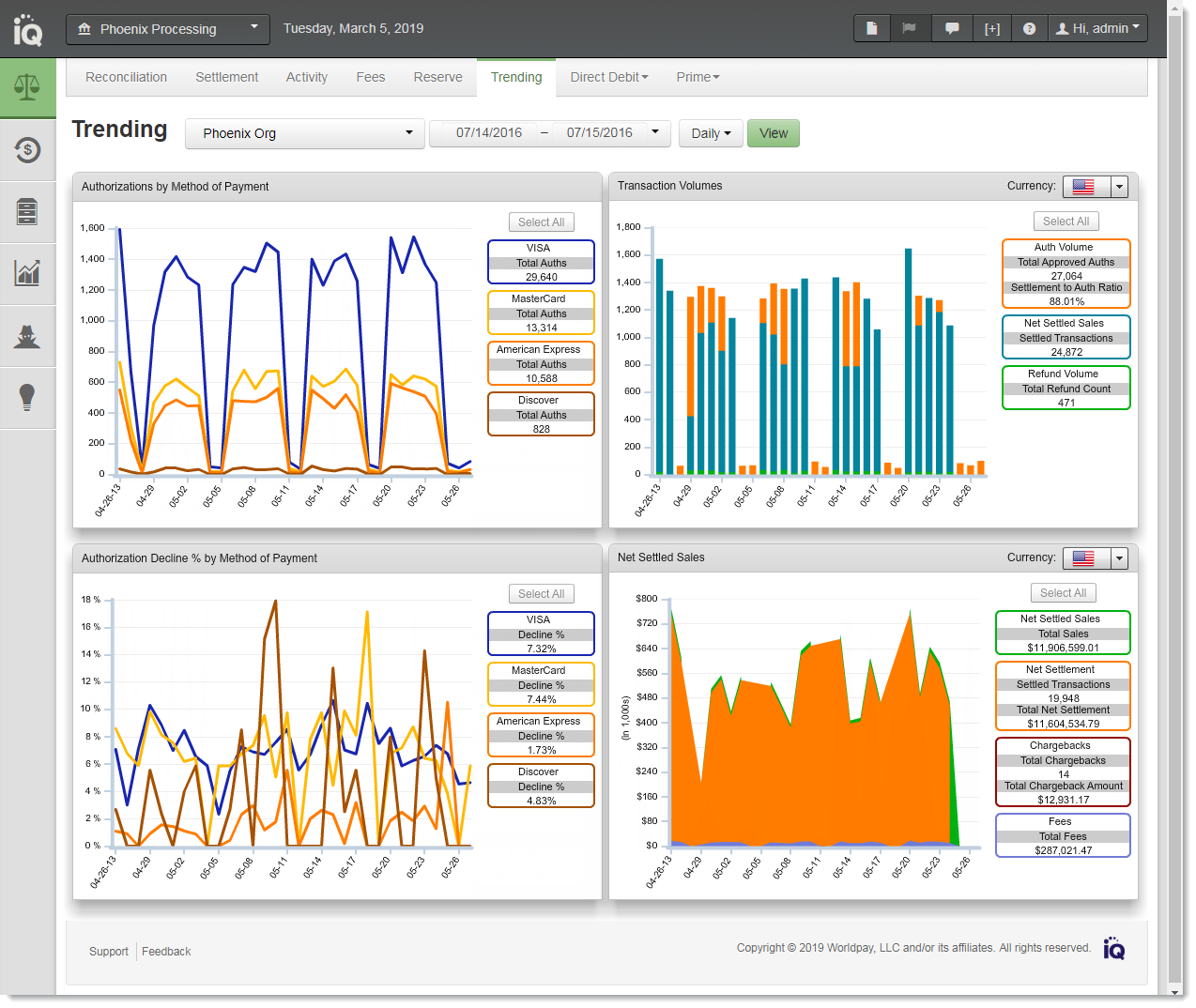
The Analytics Dashboards provide data visualizations of transactional and financial information, as well as key performance indicators across multiple areas of your organization. Each Dashboard presents this data as single or multiple charts on a single screen. For example, the Authorization Trends Dashboard conveys authorization-related data including volume rates, decline rates, and settlement-to-authorization ratios. Analytics Dashboards are similar to the example shown below.
The following Analytics Dashboards are available:
-
From the Financial suite of reports - Trending Dashboard.
-
From the Fraud suite of reports and tools - Snapshot Dashboard, Post-Deposit Impact Dashboard, A-B Impact Dashboard.
-
From the Insights suite of reports and tools - Insights Dashboard.
Authorization Trends Dashboard
Common Analytics Dashboard Features
Common features of the Analytics Dashboards and individual charts include:
-
Granularity/Rollup Selector - the Rollup Selector, located to the right of the date selectors, allows you to specify how visual data is displayed in each of the charts–daily, weekly, monthly, or yearly. The level options available are appropriate for the date range you specify. For example, when you specify a thirty day range, only the daily and weekly rollup options are available; when you specify a six month range, only the weekly and monthly options are available.
-
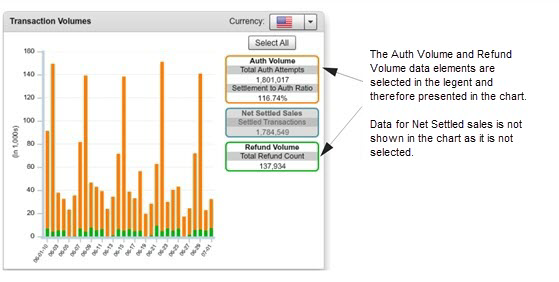
Interactive Legends - many charts contains an interactive legend where you can select some or all of the legend elements to change the data displayed in the corresponding chart. When you click a legend element, the chart displays data for selected element only, and de-selects the other elements, removing the data from the chart. When you select additional elements, the data is added to the chart.
Click the Select All button to include all available data for the specified time period. (Initially, all legend items are selected, and therefore presented in the chart.) The legend labels and colors correspond to the data elements in the chart. The figure below shows an example chart with two legend elements selected:
-
Automatic Axis Scale Adjustment - when you change the chart visibility information by changing either the date range, rollup selection, or legend selection(s), the x- and y-axis scales automatically adjust to display the chart data in the best possible manner.
-
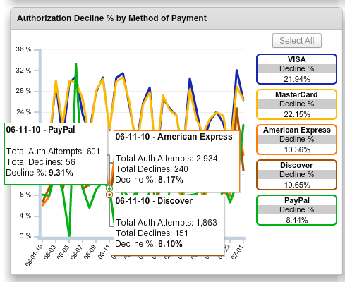
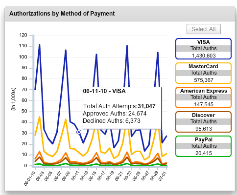
Data Tips - when you position your pointer over a particular data point in any chart, the chart displays a Data Tip window showing enhanced data, as shown in Analytics Chart Showing Single Data Tip.
When several data points overlap on a chart, multiple Data Tips are displayed simultaneously when you position your pointer over the overlapping data point. An example of this feature is shown in Analytics Chart Showing Multiple Data Tips .
Analytics Chart Showing Single Data Tip
Analytics Chart Showing Multiple Data Tips